Zedrin
patreon
I'll start tagging these with Curly Hacked in case people want a big feed of this project's progress when browsing my patreon page.
I'm making good progress, this shouldn't take much longer tbh. The advantages of working with a single camera angle.

WE HAVE QUOTE NOW
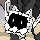
The transparency for him took me a minute to figure out, and I'm not sure it's 100% right yet. The inconsistent transparency might be distracting.
I can alternatively make him evenly transparent, or even a silhouette (though that'll lose some details on him).
What do you guys think?
The ones above will be called gradient transparency.
Here's a few other versions for alpha: flat transparency (consistent, shows details still)

Silhouette transparency (clean, sacrifices detail):

And for control, no transparency (still darkened a little like the others so you can see the difference better):

Edit:
I want Quote to be visible somehow due to A: I put a lot of detail into him, and B: the final part of the scene requires him to be visible. One other idea is to start with a more vague / less visible transparency (like a transparent silhouette) and have it fade to opaque right before the final scene / whenever dialog / interaction is present.


I think I like the gradient transparency the most. It's just enough to show everything that's happening, but I can still see my boy Quote
I like the gradient transparency
That sounds like a good way to set it up! I'm like 95% here for that tiddy though >w>
there actually might be! Well, not a switch, but I can transition between those at points in the animation. Start out and end with opaque, and maybe do a close-up / cut-in of just the puss with nothing in front.
I prefer silhouette, it gives us the best view of Curly without sacrificing plot, even if we can't see the detail. I disagree with "fake name", there's too much interaction here for hovering dick to really work. If silhouette's out, I'd go for flat transparency.
I'd go for either the flat transparency or the silhouette, mostly because they give us a better view of Curly.
The flat transparency seems good. Shows the detail on curly as well.
No transparency seems fine, I like the details on him.
Honestly, I think the silhouette transparency reads the best. I wish there were a way to implement a toggle switch between that and the zero transparency option! xAx
I'm personally for the flat, darker transparency - looks better to see both Quote and Curly that way imo.
¯\_(ツ)_/¯
hard part is the final part of the scene requires quote to be visible.
They're all really distracting, the silhouette the least so. There's always the hentai-standard of just showing the dick, which is my choice IMHO.
do you mean the gradient transparency or the flat transparency?
For those saying "first" do you mean the one in the very first pic, using the gradient? Or the first 'alternative'?
absolutely :V
I think the first transparency option looks better in my opinion. We get to see more that way
I prefer first transparency. It works the best.
What AXAH said.
I believe if you used the first transparency you’ve shown and then fade into the shadow transparency everyone would get a better understanding of the detail and what’s going on therefore everyone would enjoy the actions that are being made more than just viewing from one single transparency.
I'd keep the detailed transparency, since I like all the details you put into Quote. Either way, you're doing amazing work!
I think flat transparency looks best as we can still tell who’s who
Are they shipped together?