fault
patreon
It's like we're basically partially remaking the game orz
New comers will have no idea the history behind milestone one...
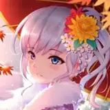
Want to see them bigger? Download the attachment and you can see in detail, just like all of other posts.
Have a wonderful day folks~!


I'm really digging Cid's new design. I fucking love Cid.
I love both designs and quite frankly the new design shows a better facial expression. I think thats how he is supposed to look from my perspective. both designs are awesome the newer designs bring out more expression and depth for each character. yes the old design actually softens the expression but i still think the new designs are badass. Rudo is meant to have a mean streak about him and he is the CEO. Also just a thought/suggestion i was wondering if you guys can try making Melano's eyes have a red organge-ish evil glow effect when shes mad or upset or serious? seriously would creep me out if you guys added that especially during Fault 2 at the beginning. its just a thought :P
Telling you the new designs make the characters have more depth and their expressions look better :) cant wait to see Ritona and Selphine designs :D Im actually going to play this on my PS Vita once its released
Hmm. I think I also prefer Rudo's old design for the most part. Don't get me wrong- it's still nice and the body is definitely way better now, but something about the face seems to give a different message. He seems more actively angry. This is a HOT anger compared to the previous COLD anger that the game described him having. This comes out most in the eyes; previously, his eyes were less focused, as if the person he was talking to wasn't worth his time. Now, he's more focused, but seems to have less control, to the point where I can't even picture a happy face on him. That's my opinion from a purely artistic design standpoint. Everything else about him is better now- the clothing, the position of his hand, the hair... well, the shadows might be a bit too sharp to be realistic (especially on the neck), but that's all.
He looks more frustrated, stressed, and angsty than malicious to me...
Can't wait to see Ritona's make over!
Man, i am loving all these redone designs!
I would argue that the scarier he looks throughout 90% of ms1, the better. Remember, people aren't suppose to know he's a good person till towards the very very end of the game.
They all look better for the most part but I prefer Rudo's old design not saying the new one is bad it's just something about his eyes in the new one that makes him seem malicious.
Just squeed a little bit with you responding to me! :D Love you guys!
Thank you. That means alot. I know that these monthly contributions aren't easy for some people and I want to do my best to justify these costs. All of your comments are always appreciated!
I agree with Shirakami! You guys seem to be doing really nice on the community aspect! ^-^
Having more information/content/stuff/whatever flying around is always a good thing, as long as they aren't mandatory for the game and they are accessible. But since most of it is somewhere here on patreon it should be somewhat fine. As a patreon, it certainly is a nice regular dose of fault milestone, while waiting for the next game :D I love hove communicative you guys are.
Indeed. This is true. And this Patreon just keeps growing in content so it's nice for everyone I suppose. =D
But on the other hand, those that are interested in this game have a lot of information they can go through :D